The report will allow you to quickly gain insights into which of your employees handles the most telephone connections, sends the most emails, and generates the largest amount of tasks.
In this article, you'll find:
- What is a user activity report
- What do the graphs of the report show
- How to interpret the statistics broken down by individual activities
1. User activity report
In the Suggester, the user activity report is:
- Clear visual reports
- Tracking of actions taken by users
- Tracking statistics
- The ability to analyze a user’s effectiveness on the basis of activities
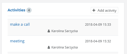
On the basis of the user’s actions within the system, the following activities can be displayed: emails sent, tasks created, VOIP calls, notes added to the client and all activities which were manually added to a client’s card, i.e. meeting with the client, skype interview, etc.
The following filters are available for the report:
- Created => here you can select the user / users whose activity you want to see
- Date from -Date to => The range of time you want to see statistics
- Customers => you can choose for which client / clients you want to be displayed
- Grouping => allows you to select the time range from which to group values - day, week, month, quarter or year.
- Department => you can choose a department whose users you want to compare
- Status => you can choose the status of the customer for whom you want to see user activity
2. Graphical charts of the report
The reports contains several charts that can help you quickly see how your team works. Thanks to these charts you can compare the results of individual employees and identify what problems they run into, what they should improve on and in which areas they perform well.
Data from the report can be displayed on three different charts:
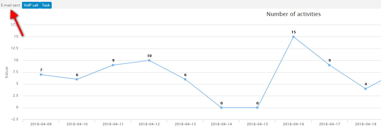
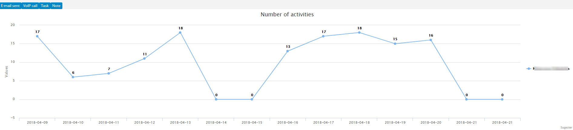
Linear
The graph will show the number of individual activities for a specified time interval. Time is displayed on the X-axis, the number of activities is set on the Y-axis. By default, the graph will display all the data for all the users, but you can always choose which activities you want to see.
Warning! If you choose a date range of one day, this chart will not be displayed.
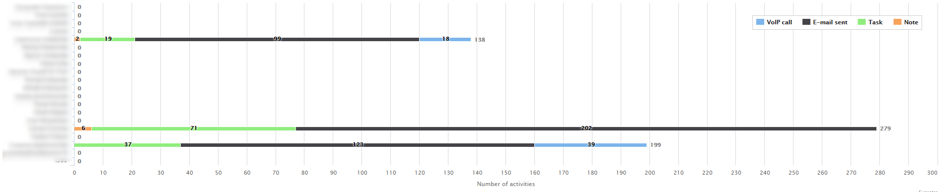
Bar chart
In this graph, each row represent both the number and the type of activity of a particular user. With it, you can compare the effectiveness of individual employees.
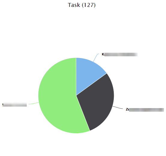
Pie chart
This graphs shows the share of a specific user / users as a percentage of the total activity for a given time interval. Each activity is represented by an individual pie chart.
3. How to view statistics broken down by individual activities
Using the charts, you can compare the results of individuals users in relation to specific activities.Linear graph
If for example you only want to compare the amount of emails send out by 2 employees, simply uncheck the other boxes above the graph and only leave the emails sent box marked.